Apple Health - New Goals Feature
Helping users make healthy changes in their lives
My Role
UX/UI Designer
UX Strategies
Competitor Analysis, User Interviews, User Testing
Deliverables
Persona, Task Flows, Mockups
THE CHALLENGE
Apple Health provides a way for iPhone users to see an overview of their health data from various sources, from the Apple Watch to integration with a huge number of health-related iOS apps. Users can view progress and trends in their health activities, from water intake to mindful minutes. While users who also use the Apple Watch can set 3 specific goals related to their activity, the app lacks a way to set goals related to most of the many health areas that it tracks. So, my challenge was to add a feature that would allow users to leverage all that existing data to set goals so they can better their health.
This project is a speculative feature created for a bootcamp course, and I am not associated with Apple.
THE IMPACT
The Apple Health app comes pre-installed on all Apple iPhones, so it has more than 1 billion users (or potential users) worldwide. In 2019, one survey found that more than half of Americans wanted to be healthier – 59% wanted to exercise more, 54% said they would eat healthier, and 48% resolved to lose weight. Adding a feature to Apple Health to allow users to set goals could help millions of people achieve their goals.
RESEARCH
I had some questions I needed to answer before I could create a feature that really answered people’s needs. How do people prioritize and set goals for their health? What technologies are they leveraging to help with their health goals, and what pain points do they have in the process? How do competitors allow users to set and track progress toward health goals?
Competitor Analysis
I started with evaluating competitors, so that I could get an idea of the features that were already out there and where this new feature for Apple Health might fit into the market. I included:
FitBit for iOS, a popular activity tracking app that goes with proprietary FitBit activity trackers, which I chose for its goal-orientedness.
Strides for iOS, a non-health-specific app which allows users to set a wide range of goals and track their progress, which allowed a window into what goals could look across a large range of health- and non-health-related categories.
Apple Activity for Apple Watch, which isn’t a competitor because it is owned by the same company, but I felt it was important to evaluate what features were available to Apple Watch users so that there would be symmetry with the new feature for iPhone users.
As you can see from this analysis of features, adding the ability to track health goals to Apple Health would make it a really comprehensive application.
User Interviews
Next I wanted to learn about how people form, track, and motivate themselves to complete their health-related goals. On this chart, you can see the 4 people I talked to about the ways they take care of their health, their experience setting and keeping health goals, and what technology they use to track health goals now or in the past. Their positive comments are on yellow sticky notes, and pain points are in pink. This chart was created with the use of the Miro application.
By reorganizing my sticky notes to group notes with similar themes or sentiments, I discovered several key insights that I used to frame my priorities for the new feature.
DEFINE
Persona
Created from a conglomerate of interviews and market research, this persona guided me as I created wireframes and mockups. What would Dianne like?
It really helped me remember throughout the process that the people using the app are busy and probably not completely focused on the maintenance of their health, because life gets in the way. I knew I needed to keep the feature motivating, simple, and not a time-suck.
Task Flow
I imagined how Dianne might flow through the app to create a goal within the Apple Health app, so that I had a clear idea of the screens I would need to mock up in order to properly test my ideas. This shows extremely low-fidelity wireframes in the flow to create a goal within the app.

DESIGN
In the design phrase, I sketched out some ideas with a pen and paper. Then, since I had some infrastructure from the existing app, I jumped right into hi-fi mockups using the User Interface Guidelines from Apple as a guide. I used these screens to make a prototype, which you can see here.
Sketches
Here you can see some of the pages from my paper-and-pen sketchbook where I hashed out some of my ideas before making them digital. You can see that I first tried to insert all the goals tracking, adding a goal, etc. onto the summary page itself. But the more I worked it, I realized that I needed to keep the simplicity of Apple’s brand on that summary page, and that I could make an equally simple activity just for managing goals.
Mockups
I didn’t want to add too many new screens for such an integrated feature. I reworked the summary page to add goals trackers for all categories that had a goal set, created the specific Goals page for users to track and manage goals in more detail, and used existing pages as guides for the Add a Goal flow.
TESTING
To test my prototype, I had three users complete 2 tasks:
1) Without touching anything yet, take a look at the Summary screen. What things do you notice and what information do you think they’re telling you? What do you think might happen if you tap on the things you’re looking at?
2) You want to have the app remind you throughout the day to drink more water. So your task is to set up a goal to drink some more water, and then to view your progress so far to reaching your goal today.
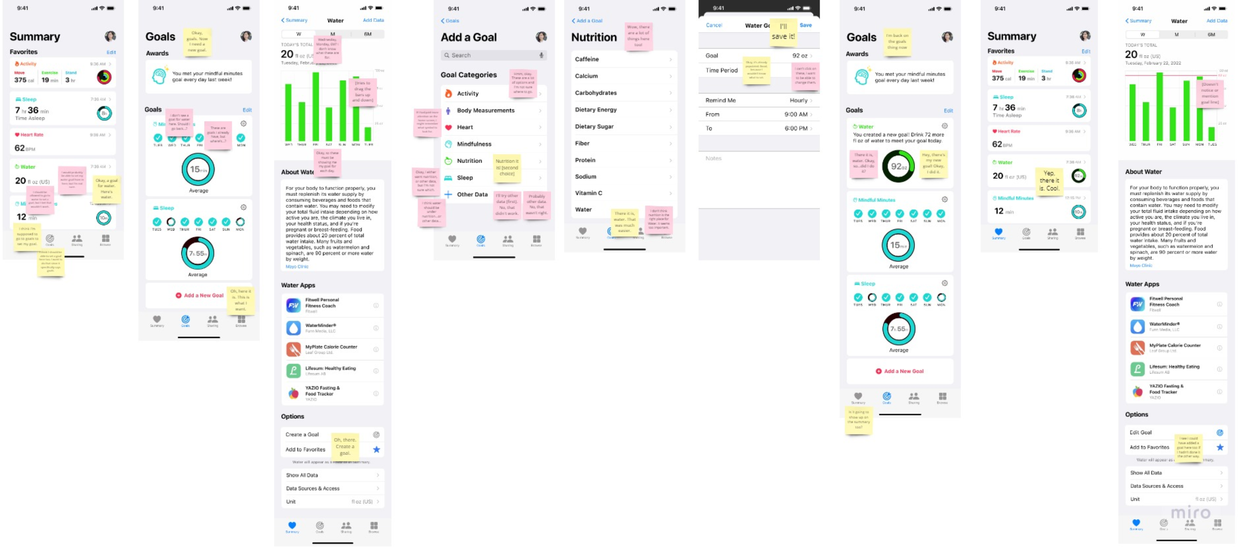
I use sticky notes to take notes and present results from testing because it makes it easy to see where the pain points are clustering.
As you can see, the “Add a Goal” browsing page is almost entirely comprised of pink sticky notes. Something there wasn’t working. People were confused about where to look for the Water goal, and expressed frustration that such an “important” goal shouldn’t be hidden away in an unintuitive place.
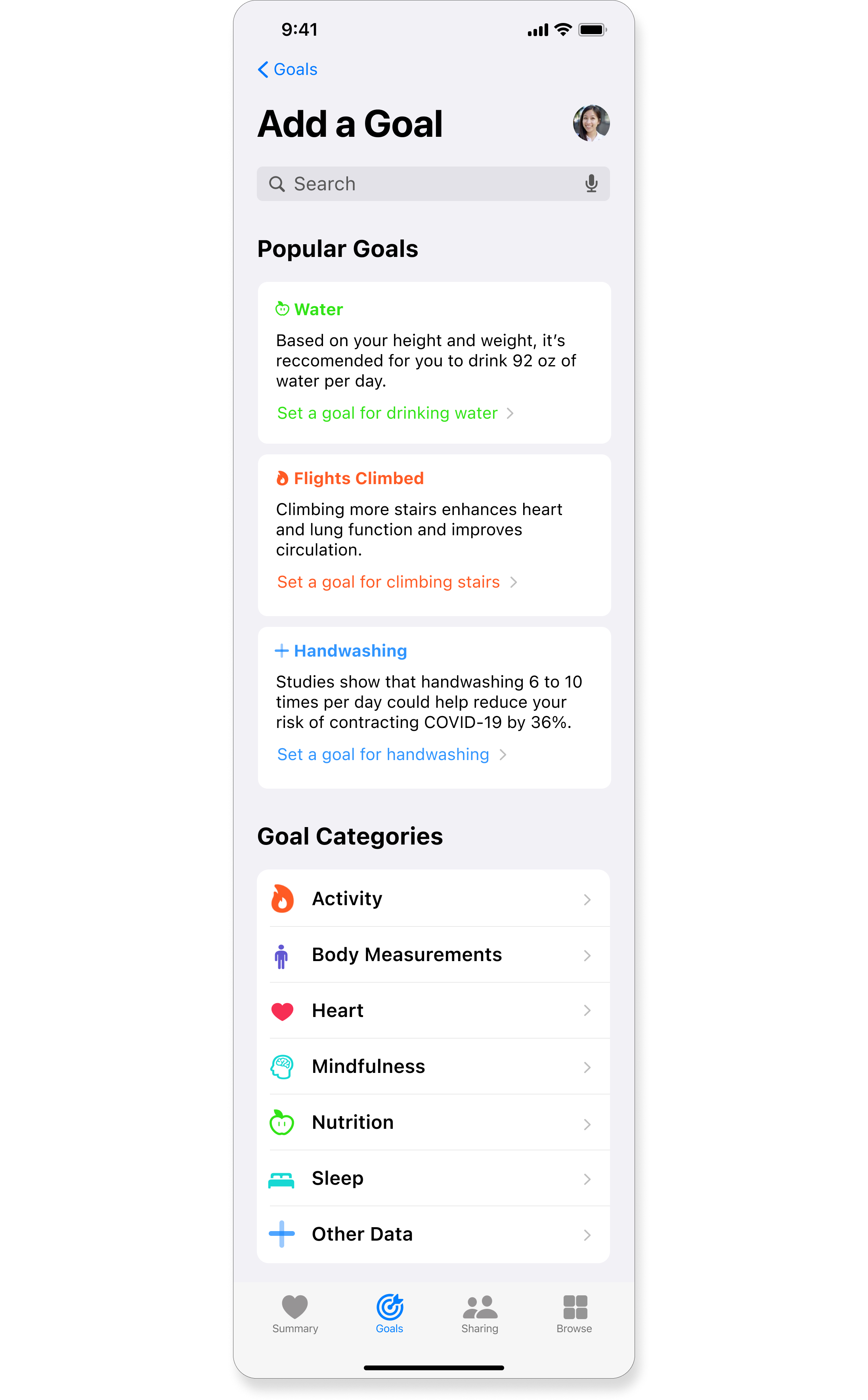
After
I’ve added suggested, popular goals with some insights into personalized recommendations for settings and inspiring potential benefits.
Before
This page looks almost exactly like the existing “Browse” feature within the app.
NEXT STEPS
My next proposal to this Goals feature is to integrate it with the Sharing mechanism existing within the app, so that users can challenge family and friends to race to a goal. Since my research indicated that many people are motivated by their social circle, this could really help make the goals feature fun and effective to use.
LESSONS LEARNED
Since Apple’s users are so diverse, with more time and resources available I would have wanted to interview people from a wider range of geographic areas and cultures.
Even when consistency is important in working within an existing app, I should prioritize the function and ease of using the new feature over reusing mechanisms from other parts of the app, which I learned from the browsing feature.


