The National
Mustard Museum
A responsive website redesign for a local business.
My Role
UX/UI Designer
Strategies
Competitive Analysis, User Interviews, Card Sorting, User Testing
Deliverables
Persona, Sitemap, Customer Journey Map, UI Library, Mockups, Prototypes
THE CHALLENGE
Located in Middleton, WI, the National Mustard Museum has over 6,000 different types of mustard and hundreds of pieces of mustard memorabilia. The museum has been featured on countless features on national television, radio shows, and in national newspapers. It is part museum and part novelty shop, with a huge selection of mustards for sale from around the world.
The Mustard Museum’s website is outdated, and since it contains a huge amount of mustard and museum-related information, it can be difficult to navigate. The website is also not responsive, so mobile users are unable to do more than check open hours.
THE IMPACT
This is a speculative project, so it has not been implemented. However, the Mustard Museum does not charge admission, and so relies on donations and mustard sales for its income. According to one study, 81% of people think less of a brand if its website is not updated. Also, 39% would think twice about using a product or service if the website isn’t fresh and current. Around 43% ranked ease of use as a top priority in making their online experience better. So, the museum could improve its attendance and conversion rate by almost half if its website is modern, engaging, and easy to use.
RESEARCH
I had some questions I needed to answer before I could create a website that really answered the museum’s needs. How do people choose a museum to go to? What information do they want from the museum before they visit? How do users interact with specialty stores and their websites?
Competitor Analysis
I evaluated 4 competitors, including:
The House on the Rock, another quirky local museum, which I evaluated because they are a direct competitor in clientele
The National Bobblehead Hall of Fame and Museum, another combination novelty museum and shop, evaluated because it has a similar business model to the Mustard Museum
Galco’s Soda Pop Stop, a novelty soda store with personality, selected for its eye-catching personality and quirky selections
The Candy Club, an online candy store with good organization of products and services, with strong UX
User Interviews
I interviewed 3 people about their museum-going and specialty-shopping habits. The questions I asked were about some experiences they had recently had at a museum, how they had chosen it, and how much information they like to know about museums before going. I also asked about locally-owned specialty shops and how they interact with those stores and their respective websites.
Below you can find my notes from those conversations, taken in Miro.
From my interviews, I noticed several key trends.
People are likely to decide to go into a museum while out and about.
This means that a responsive website is absolutely essential, as people may look at a museum’s website on their phone before deciding to go in.
The website should quickly highlight the best reasons to go inside.
People are typically looking for the same basic information about a museum before they go: hours, price, and location.
This information needs to be prominently placed on the website and easy to find.
Other information can be findable for people who like to dig deeper, but doesn’t need to be as prominent.
The thing most people like about shopping at specialty shops is the variety of merchandise that isn’t available at a typical store.
So, the store should feature the specialness of being able to find difficult-to-find mustards and the sentiment, “If you can’t find it here, you won’t find it anywhere.”
DEFINE
My next task was to use the information I’d gleaned from my research to define my path for the redesign.
Site Map
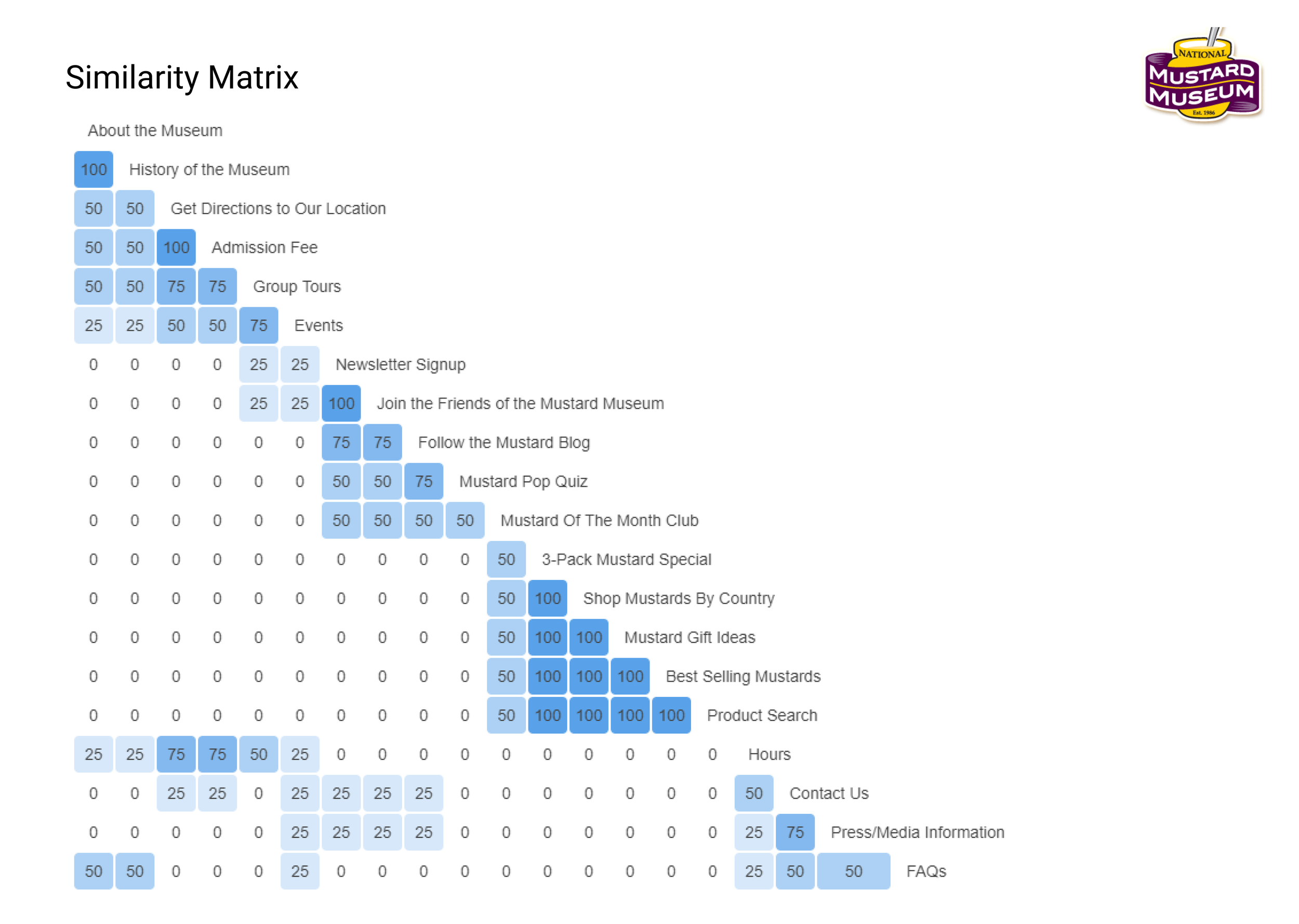
Created with the help of a card-sorting exercise, this site map helped me organize the basic structure of the information architecture of the redesigned website.
Similarity matrix created from results of Optimal Workshop study, showing which things were often grouped together by 4 participants.
Persona & Customer Journey Map
I used my key trends and takeaways from my interviews to create this persona. Zayn is one example of someone who might visit the museum, conglomerated from interviews and my knowledge of the area and its locals.
After getting into Zayn’s head, I used him to create a customer journey map which allowed me to narrow down the feature priorities of my designs.
Feature Priorities
I settled on 3 key feature priorities for the initial screens of my redesign.
Landing page must display value of the museum (why you should go inside) and essential information including hours, location, and pricing.
Store must be easily browseable with simple categories and filters.
Include information on history of museum and special exhibits.

DESIGN
I created these designs by doing some low fidelity sketches and wireframes in a notebook and then translating into high fidelity UI designs and a prototype of the desktop version.
Sketches
My sketchbook doesn’t have any stunningly beautiful drawings. Instead, it’s a place for me to get ideas and notes down so that I can make them beautiful later. Here, you can see a selection of pages from my sketchbook on this project, from the responsive homepage to a couple versions of the shop page.
Home Page
Users immediately get a sense of the fun and whimsy of the museum, and can discover its hours and how to visit without ever needing to click on another page.
Shop Page
Here, users can browse the many mustards and memorabilia for sale at the museum, join a subscription service for monthly mustards, or find gift ideas for a mustard lover in their lives.
About Page
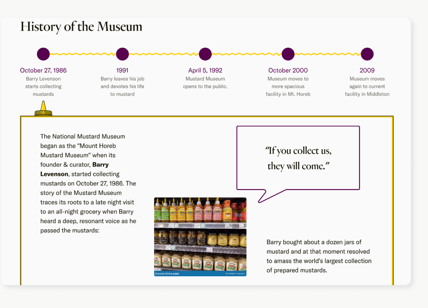
An overview of the museum is followed by an interactive timeline of its history, some featured exhibits, and info about the museum’s fun Poupon University.
TESTING & REVISIONS
My initial version of the About page reused the second from the landing page that described what the museum was. In my testing, I found that users were confused by this. One user even thought they hadn’t changed pages at all!
In addition, users skimmed most of the information rather than reading it. They were overwhelmed by the amount of reading on the page.
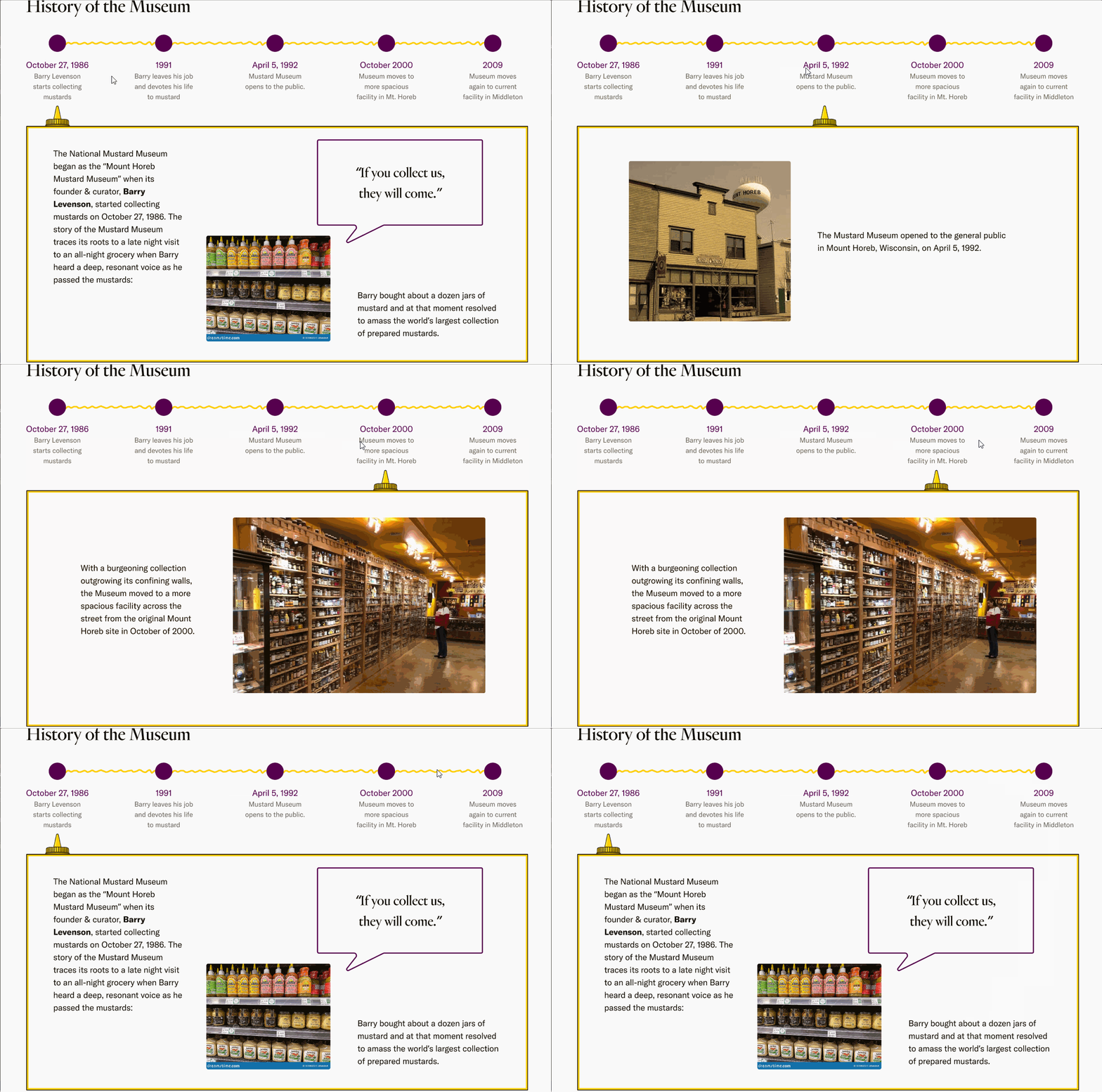
I concluded from my tests that the page needed to be more skimmable in addition to changing the feel of the about section. I made the timeline interactive via hover so that the information was there in a more consumable way.
A better view of the hover action for the new timeline
LESSONS LEARNED
This website is far from finished, but there are a few things I learned while working on this project that I would take forward to complete this project and into future projects.
What people want out of websites is ever-evolving.
There was probably a time where a wall of text on an About Us page didn’t make users want to run and hide, but now it’s important to take users where they (and their attention spans) are at.
Your most direct marketplace competitors aren’t necessarily the right thing to evaluate for website competitive analysis.
Especially if your competitors’ websites are similarly outdated. We want to stand out, so make sure some websites you evaluate have characteristics you want to emulate.
Sometimes open-ended questions aren’t the right way to get answers.
I think my card sorting results would have been even more useful if I had given users some categories to get started, rather than having them create their own. I continue to stand by open-ended questions for interviews, though.


