Mirror - An E-Commerce Case Study
A fashion brand stepping into the 21st century with a new website.
My Role
UX/UI Designer
UX Strategies
Industry Research, Competitive Analysis, User Interviews, User Testing
Deliverables
Persona, User Flow, Branding, Wireframes, Mockups, Prototype
THE CHALLENGE
Mirror is a large clothing store chain which has been operating without a e-commerce website, losing potential revenue. It was my job to create a responsive e-commerce website for Mirror that allows customers to easily find and purchase clothing for men, women, and children in the appropriate sizes and colors.
THE IMPACT
Although Mirror is a fictional project created for a bootcamp, the impact of a usable website can be estimated from research.
In the US alone, the ecommerce fashion industry accounted for 29.5% of fashion retail sales in 2020.
Using competitor Old Navy’s total revenue of $4 billion from 2019, an ecommerce website where none previously existed could add as much annual revenue for Mirror as $1.2 billion.
RESEARCH
Industry Research
I wanted to know who my users were and identify trends and threats in fashion e-commerce. I used sources like Statista, Salecycle, Data Feed Watch, and the Geneva Environment Network.
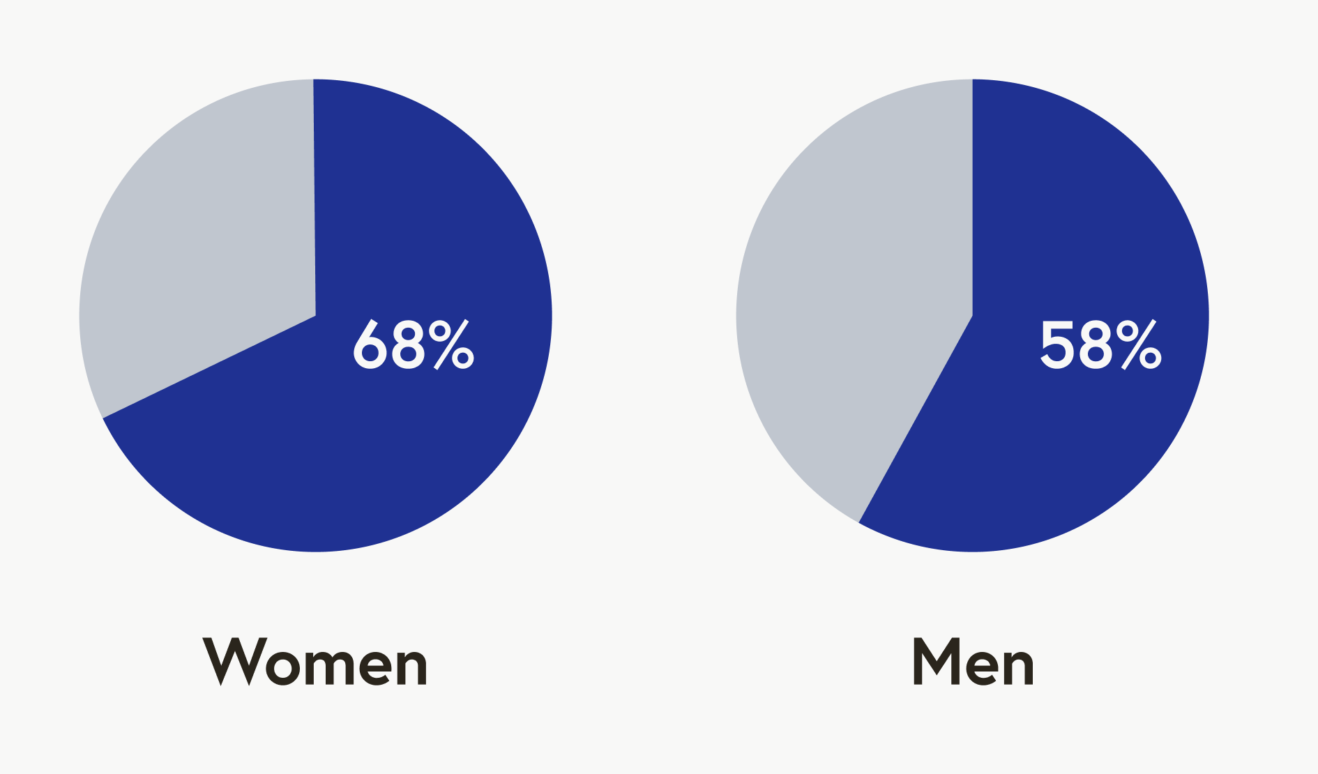
So who’s buying? 68% of women had purchased clothes online in the past month vs 58% of men. Young adults are the most likely age category to shop online for clothes, with teens being the next category.
Some trends in e-commerce are personalization, social media incorporation, flash sales, and subscription models. I kept these trends in mind as I designed, with social media integration being the only trend that made it into the MVP I created for this project.
Threats in the industry included lowering brand loyalty due to market fragmentation, the cost of combating high return rates, and pressure from consumers to use ethical sourcing and sustainable practices. To consider ways to mitigate these, I asked questions I felt answered these concerns in my user interviews.
Competitive Analysis
The fashion e-commerce market is flooded with sites that offer the fast, easy-to-use experience that customers expect. My interviews showed that users expect a certain level of functionality as a given, as a baseline, and if they don’t see it they are likely to take their business elsewhere. So, it was really important for me to evaluate the key features that make a few competitors successful.
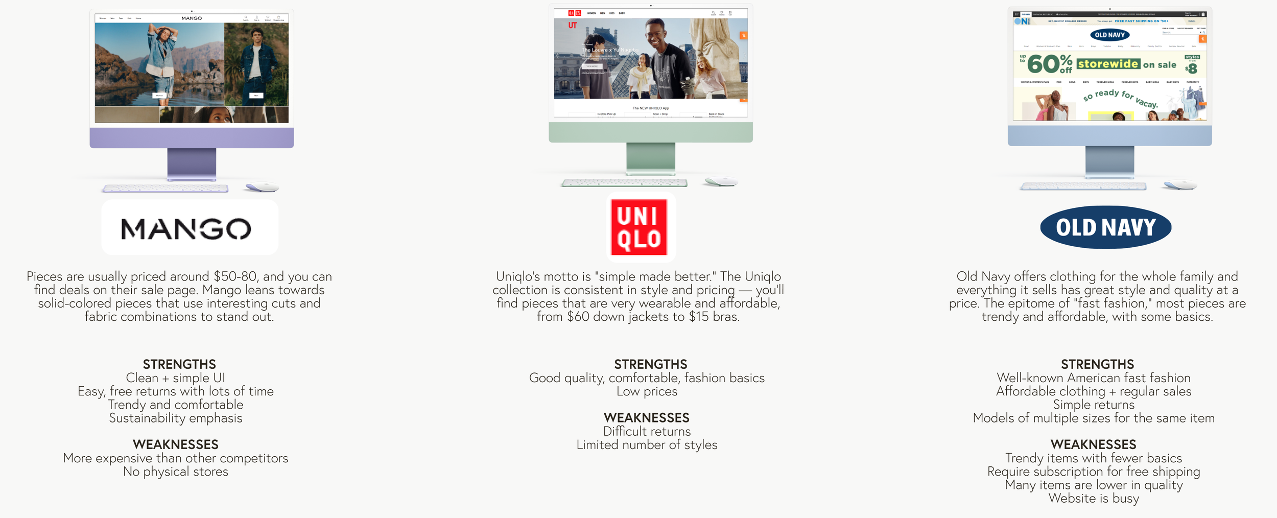
Mirror’s brand is modern, approachable, and affordable. I chose competitors at or near the same market level, each with strengths and weaknesses to consider.
Mango has a clean, delightful, and modern UI but its clothes are more expensive and it lacks brick and mortar locations.
Uniqlo has affordable staples and clean navigation, but it doesn’t have much variety in clothing items, and returns are difficult and expensive.
Old Navy has high brand recognition, a plethora of choices, and affordable prices, but it’s highly trendy and not very sustainable.
Interviews
I chose to do user interviews so that I could hear stories from real online clothes shoppers and get information that’s difficult to get from statistics. I was looking for reasons people shop at a certain place and keep shopping there, and frustrations they have with buying clothes online.
My key takeaways were:
A convenient, usable website is considered a given, a baseline for ordering from someplace, and not a reason to order from them.
People want more information rather than less, particularly from the product photos
“But they will not let me filter items that are on clearance for a specific size…. I suspect that they do that on purpose. ”
DEFINE
Persona & User Flow
These deliverables, created based on my research, helped me keep a concrete user and her goals and tasks in mind as I started out on wireframes and high-fidelity mockups.
Wireframes
Here you can see some of the versions of one of my pages in low-fidelity wireframes before I started in on the UI. I based my iterations both on my own realization of the impact of my research, as well as the feedback from peers and mentors after I presented my designs to them in a critique.
Landing Page V1
My goals for this version were to:
Make it easy for Mirror to promote categories and items
Make navigation familiar, clear, and easy to use
Incorporate social media integration per industry trends
Landing Page V2
I wasn’t completely satisfied with V1 and quickly iterated to form V2. The changes I made were:
Make the single hero image into a set of 3 so that Mirror is able to advertise multiple new lines and deals that users will be interested in.
More than one person in interviews said that they usually started shopping after getting an email from a company, so I moved the newsletter signup higher into the hierarchy.
Landing Page V3
I presented my work at a group critique and to my mentor, and I made the following changes based on their feedback.
Replace the blog post section with additional area to place featured and sale products, so users can jump directly from the home page to an item that interests them.
Create a way for users to add an item to their cart directly from the main page.
BRANDING
-

Logo
I went through several iterations working on Mirror’s logo. I knew I wanted to play with their brand name and incorporate some reference to a mirror. At first I tried this with the three-pane mirror often found in old-style dressing rooms that also looked like an M, but ended up feeling like it looked too dated. I landed on a reflection of the brand name Mirror and went through several iterations and colors of that before settling on a logo that felt modern and clean like the Mirror brand.
-

Color & Typography
For Mirror’s colors, I wanted a palette that was modern and clean, but still approachable, fun, and enticing. I went with a deep royal blue for the brand color and very bright oranges and yellows as the secondary colors, which were used very sparingly.
For type, I chose a sans serif font with a large x height for easy readability. I wanted the font to be modern and unpretentious, so a sans serif with just a little playfulness worked well here.
HIGH FIDELITY SCREENS
Responsive Design
The landing page of Mirror’s website optimized for a mobile browser experience.
I focused on making everything tappable and scrollable, with the most important things prominent and others hidden behind menus.
TESTING
Changes from user testing
I asked users to work with the prototype to add a pair of jeans to their cart. Everyone was able to complete the task, but more people than I expected wanted very nitty-gritty filtering options, rather than just the popular ones I pinned to the top of the page. I decided to mockup this Sort & Filter hover screen for the Category Page with the filters they were largely looking for.
SO WHAT’S NEXT?
I created a few key screens of a minimum viable product for Mirror where users can find and purchase the clothes they’re looking for. Here are some things I’d love to design for Mirror to add to their website next.
Favorites
There are an increasing number of stores who offer a feature for users to save items they like but aren’t ready to buy yet. Users get to organize their favorite items and Mirror is able to use a customer’s favorites to offer them more personalized recommendations.
Personalize sizing recommendations
This offers users the ability to enter their measurements or sizes from other brands that they fit in, to make sure they get the right size on the first try. This could potentially be a significant boon if Mirror finds they get a lot of online returns due to poor fit once the MVP is live.
LESSONS LEARNED
Probe for the meaning behind what’s said in interviews.
When people said they struggled with filters in the interviews, I heard “I want filters to be prominent and easy to use” but what it really meant was “I want to be able to filter on everything in the galaxy.” If I’d asked more questions, I’d have known that.
Don’t reinvent the wheel.
The fashion e-commerce area is filled with design patterns that have been optimized over decades. It helped me in my designs to evaluate those and make sure to include some of them in my designs to make the process familiar for users.


